The Challenge
The primary challenge of this project was evaluating the usability of the Library of Congress website and identifying the barriers users faced when completing common tasks. Because the site contains a large amount of dense information spread across many pages, participants frequently struggled with navigation, consistency of labeling, and understanding where core features were located. Our goal was to observe these breakdowns, analyze patterns across users, and translate findings into clear, research-backed recommendations that would improve clarity, efficiency, and overall user satisfaction.
The Process
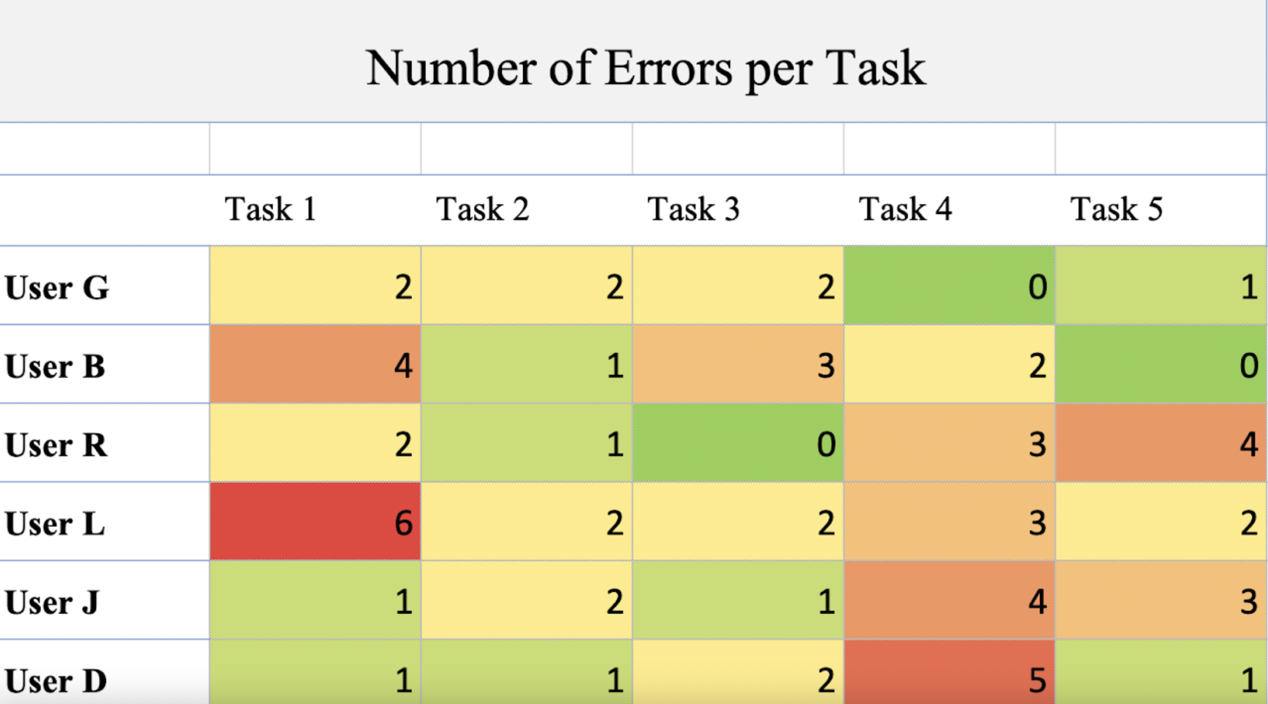
Our team conducted a structured usability test with multiple participants, focusing on five key tasks that represented common goals for new visitors. We collected both quantitative and qualitative data, including error counts, completion rates, and moments when users asked for help or reassurance.
1. Planning & Task Design
2. Moderated Usability Testing
3. Data Analysis
4. Synthesis & Recommendations
Planning & Task Design
We created realistic tasks that required users to locate exhibitions, search for items, understand catalog distinctions, and find various types of content. Each task was designed to uncover pain points in navigation, labeling, and search behavior.
Moderated Usability Testing
Participants were guided through each task while we recorded errors, confusion points, and verbal feedback. We documented instances where users hesitated, misinterpreted the interface, or needed assistance to proceed.
Data Analysis
Using heat maps, bar graphs, and comparative charts, we evaluated which tasks were most difficult and why. Patterns quickly emerged, such as issues with inconsistent labels, unclear search functionality, and challenges distinguishing between the digital catalog and exhibition content.
Synthesis & Recommendations
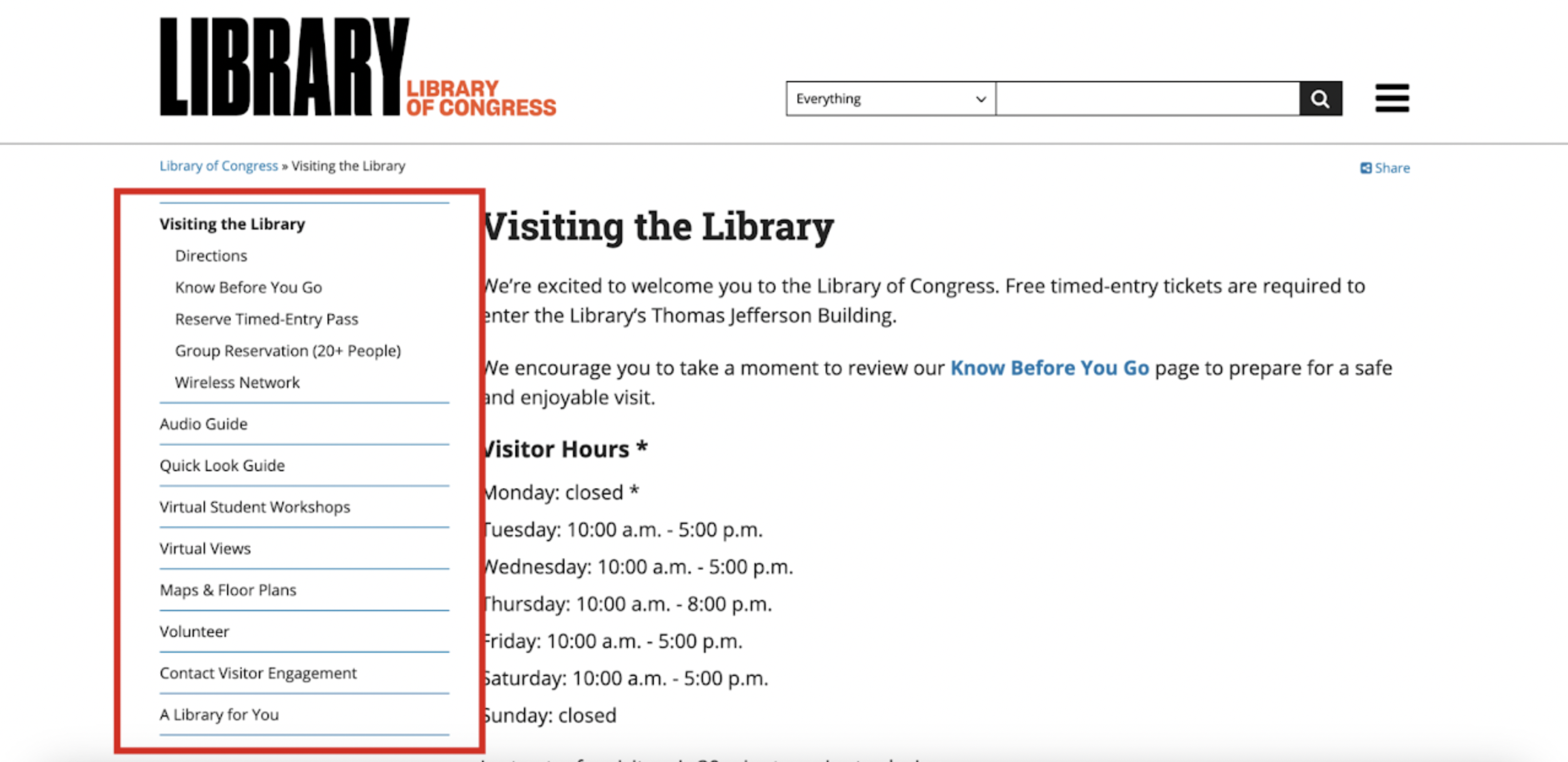
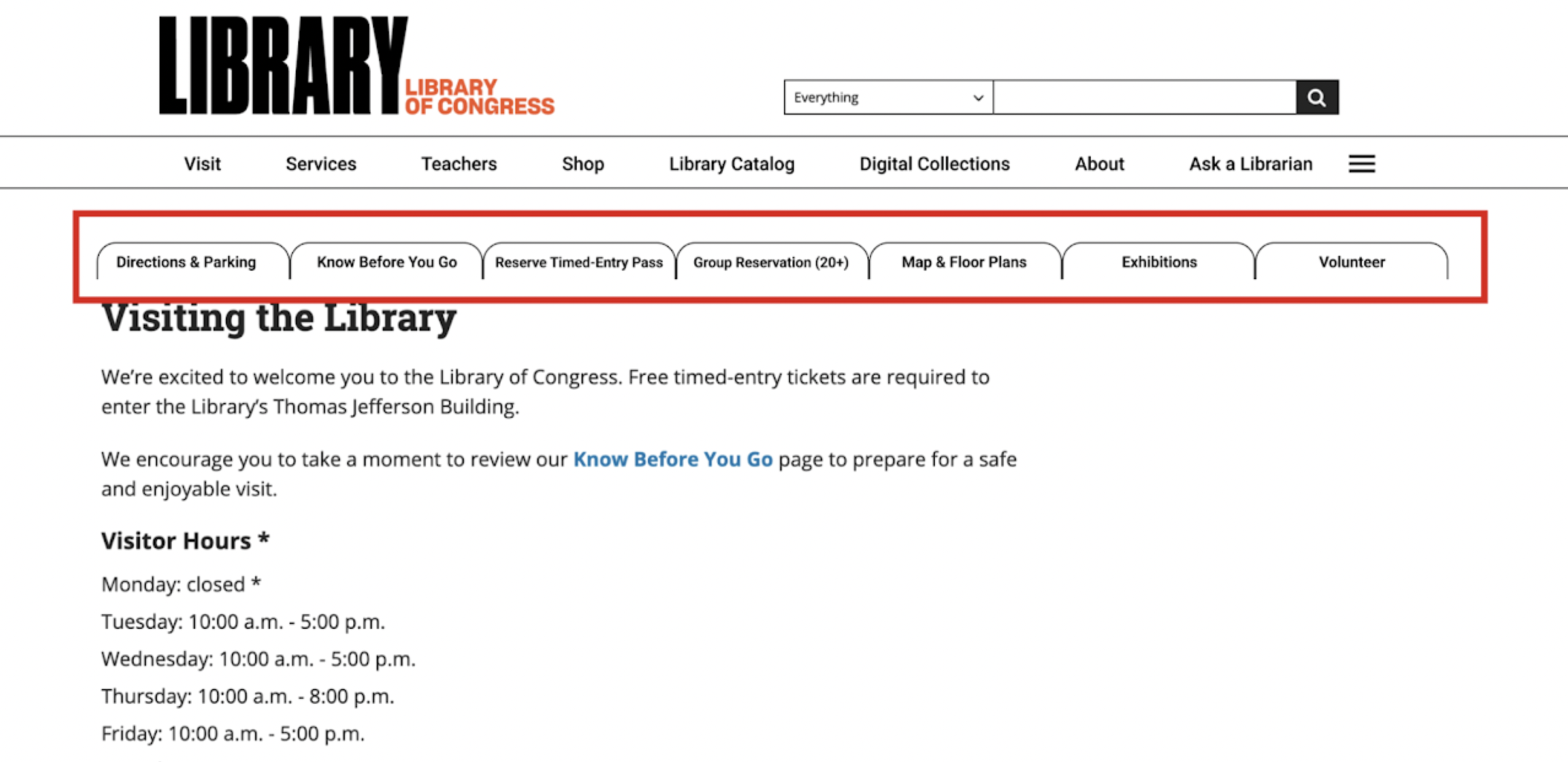
Based on the findings, our team created six targeted recommendations aimed at improving navigation clarity, increasing visibility of key content, and aligning the site with established usability heuristics. Each recommendation was supported with “before” and “after” visuals demonstrating how the redesign would solve the user-identified problems.
Reflection
This project strengthened my ability to analyze usability issues and turn them into clear, actionable recommendations. Observing real users helped me see how small inconsistencies can quickly create frustration, especially on information-heavy sites. Working with my team improved my facilitation and synthesis skills, and reinforced how essential research is in guiding intuitive, user-centered design.